Author publication networks
Visualization of author networks in the T1D literature. Individual authors are represented by nodes in the diagram. Node size represents number of last author publications. Wider edge thickness represents more papers copublished between two authors. (Criteria for author inclusion = last author on one of the top 500 cited papers from Web of Science search [type 1 diabetes or diabetes mellitus type 1 or iddm or funding:jdrf])
T1D and autoimmune associated GWAS hits
Visualization of GWAS hits associated with T1D and other autoimmune diseases. Data from Immunobase.
T1D and autoimmune associated GWAS hits
Visualization of GWAS hits associated with T1D and other autoimmune diseases. Data from Immunobase.
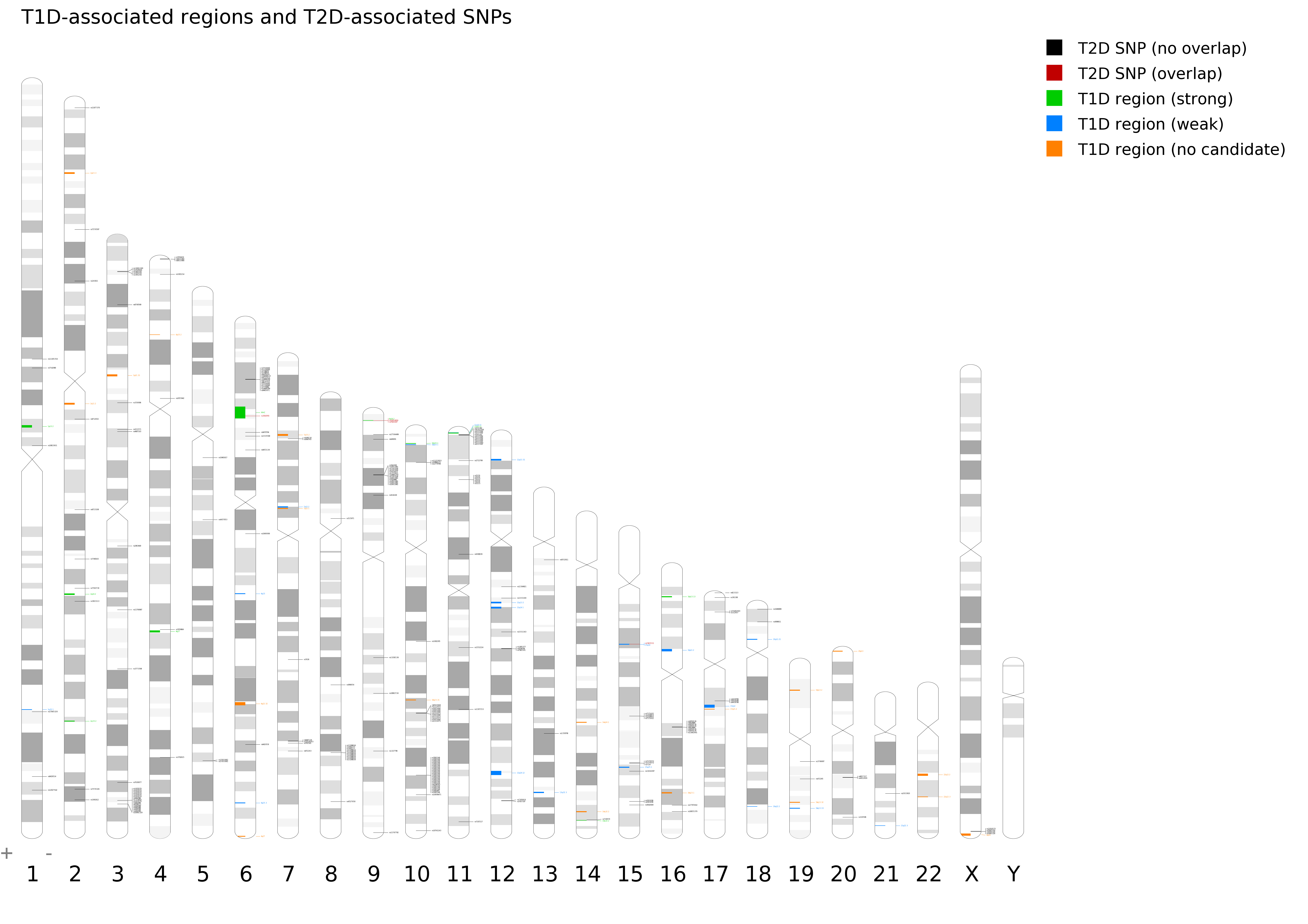
Ideogram of T1D-associated regions and T2D-associated SNPs
Ideogram showing chromosomal locations of T1D-associated regions (blue) and T2D-associated SNPs (red). T1D GWAS region data is from Immunobase and T2D GWAS hit data is from Genome.gov. Generated using Idiographica (Kin T and Ono Y, 2007).